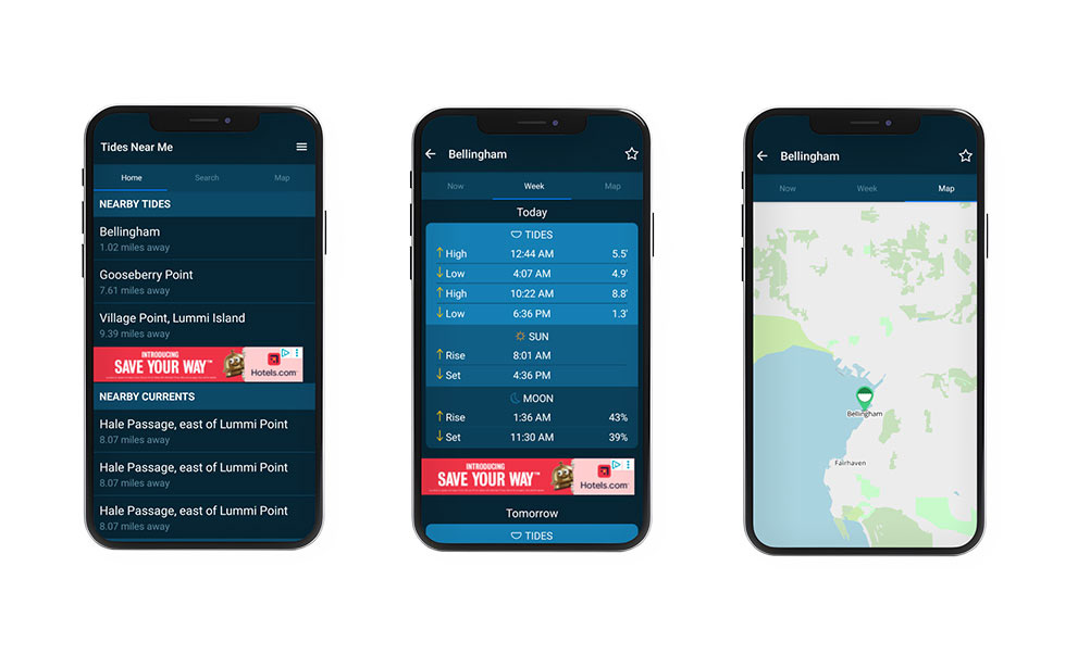
The original app design was simple, however it lacked visual contrast and hierarchy. Users had to navigate through multiple screens after opening the app to access information about tides. Additionally, finding the currents page was also confusing due to poor organization.
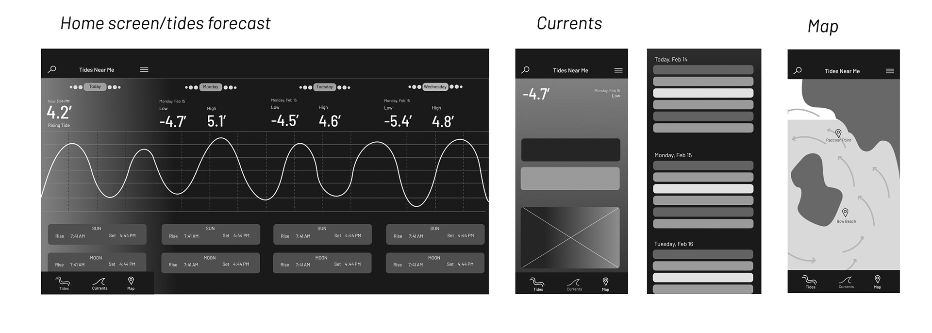
Wireframes
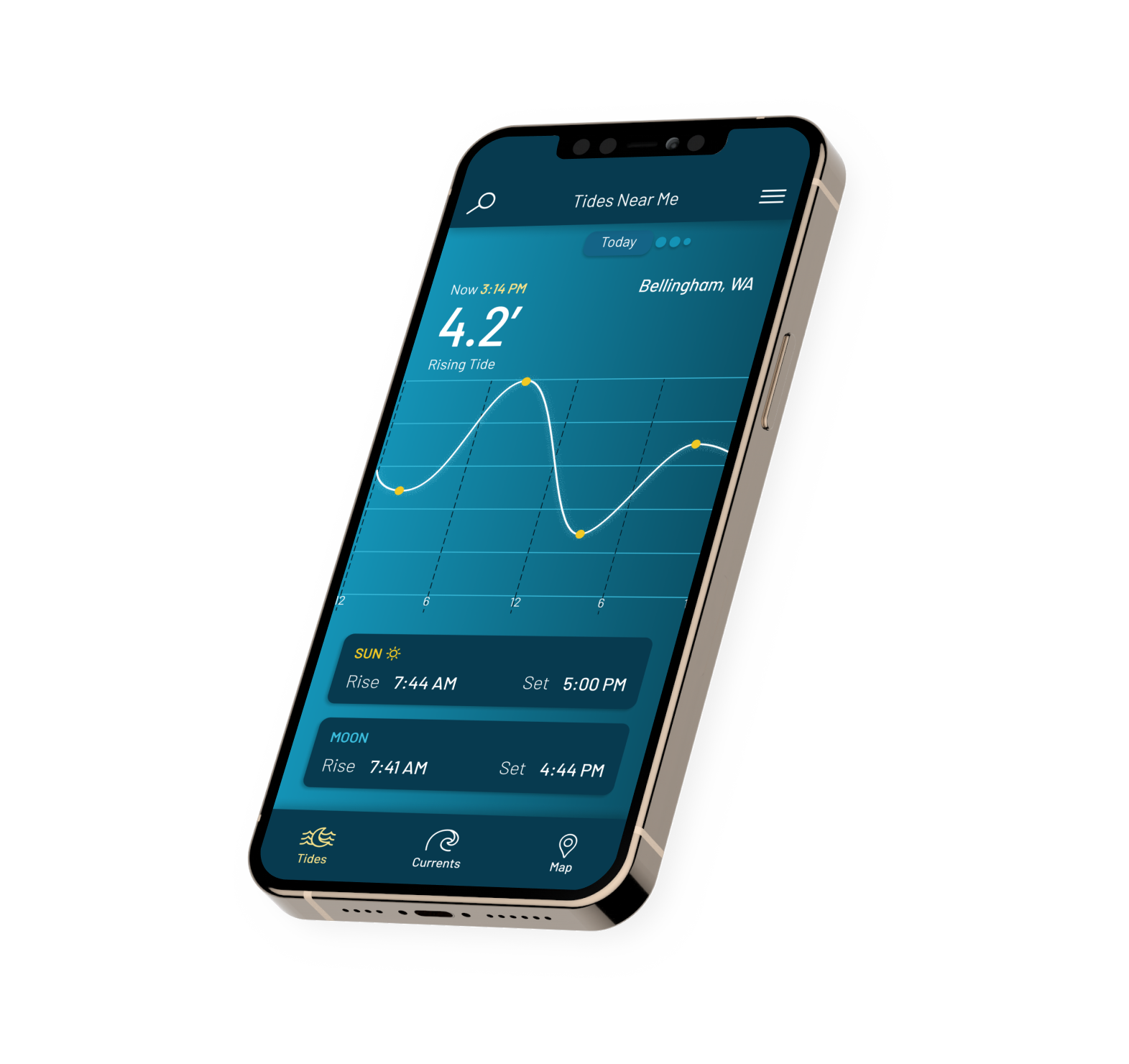
To make the app easier to interpret and more visually engaging, I added a tide chart on the home page and moved the navigation bar to the bottom of the screen.
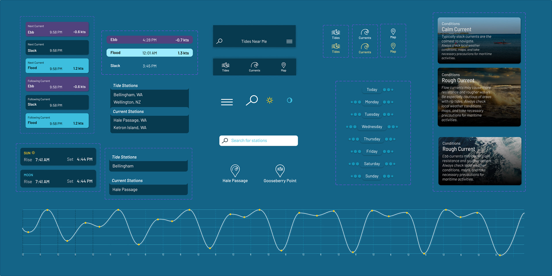
UI Component Library
I designed the tide chart, cards, and icons to be unique to the app. I wanted components to have consistent colors, spacing, and type styles.
Prototype walk-through
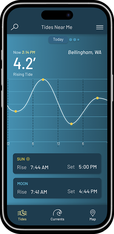
Home Page (Tides)
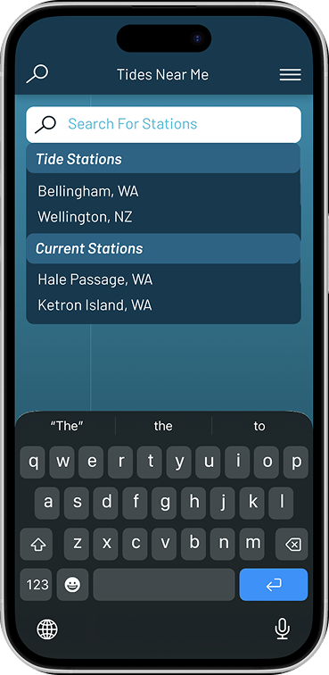
In the final design, I used a horizontal swipe for the tides page, which shows the tide chart and highlights the tide information for the current date. The search feature was also simplified to show tide and current stations as clearly separate categories.
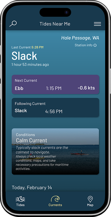
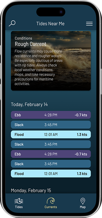
Currents Page
Since current predictions are given in a table, I designed this page with a vertical scroll. I designed the current predictions to have a clear hierarchy and easy readability, including by adding colors to each different type of current.